YOUR NEW NIGHTCAP
Sonic Drive-In, Journalism 4204
Art Director
Project Type: Integrated Marketing
Skill Focus: Creative Strategy, Photo Illustration, AI Integration, Design
Journalism 4204 is a strategic design and writing class at the University of Missouri in which I had the opportunity to work with fellow students to create a brand new advertising campaign for our client, Sonic Drive-In.
Our brief: To rebrand Sonic Drive In to connect to the YAYA Audience (Youth and Young Adult, a Mizzou coined term for the 18-24 year old demographic).
As the art director on this project, I created a new logo and brand guide, 3 print advertisements, a new website mockup, a banner ad, and client pitch presentation over four weeks. The key insight that drove our campaign was
“Our audience is leaning into late nights, cheap eats, and less drinking.”

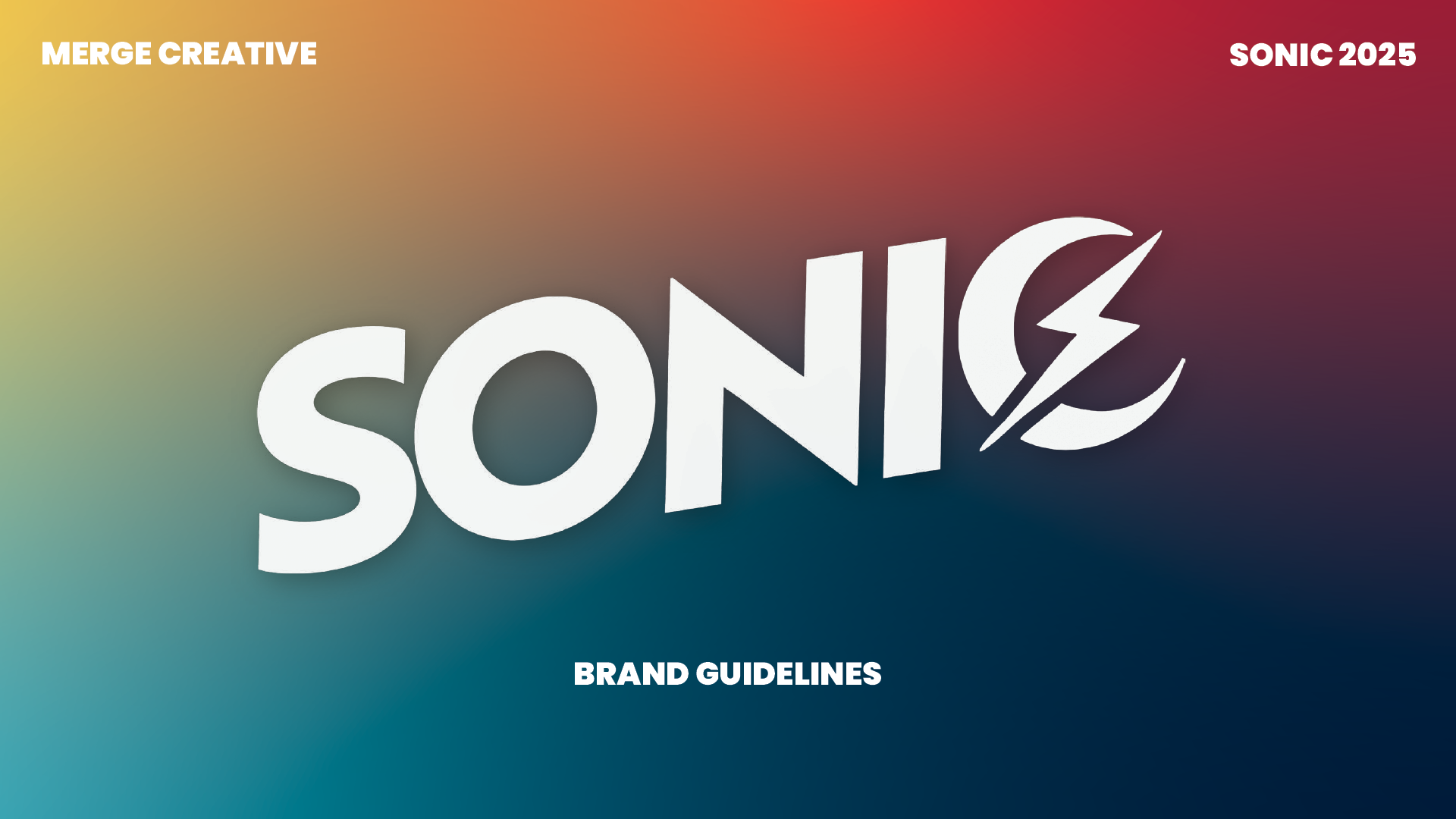
LOGO REDESIGN
As I began concepts for a new logo, I wanted to push the new nighttime energy aspect without having a bulky and unscalable icon. Simply changing the C to a more pointed end point alludes to a crescent moon, and the energy bolt provides a recognizable change from the previous branding. The 3D plane reflects an upward slope, the kind of experience we hoped audiences would have at the revamped Sonic.
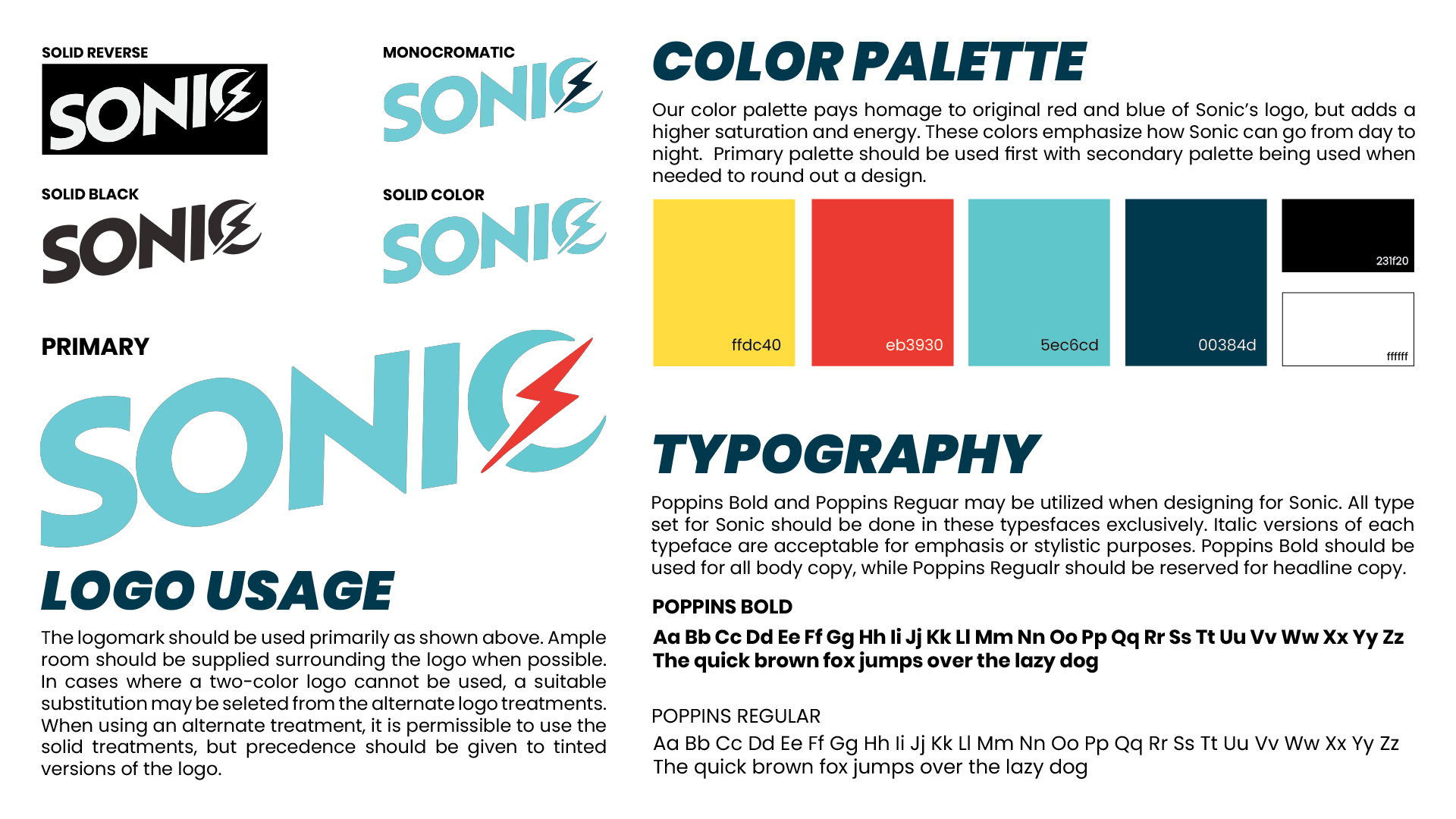
BRAND KIT
This new logo drove our campaign energy and kept us focused on our strategy, leaning into the fact that YAYA are staying up late, but need an alternative to drinking.
The colors stayed true to the original feel of Sonic, but with a bit of saturation. The yellow and orange will be used to showcase how easily Sonic can transition from day to night.
PRINT ADVERTISEMENTS
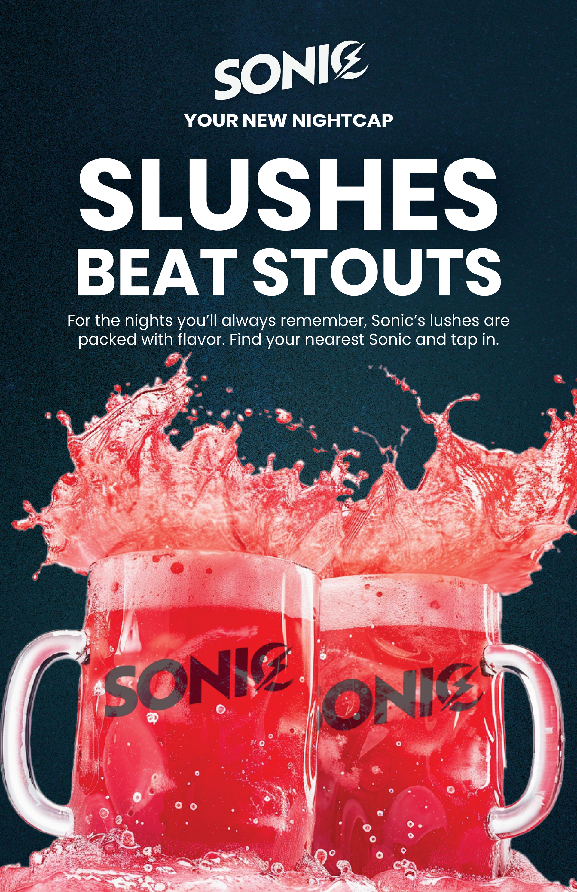
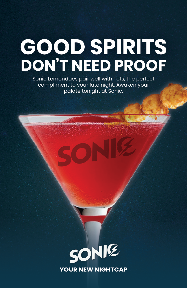
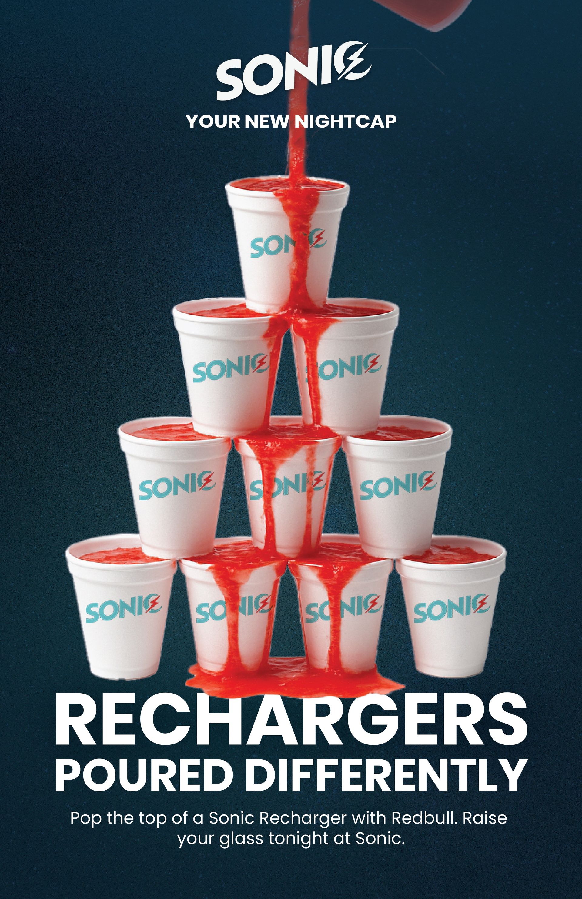
On this project, I got to experiment with risky imagery and copy. Here we struggled with making sure our messaging was clear that Sonic was not a place to drink, but the place to go when you’re not drinking.
I was encouraged to explore AI generation with the lack of time and resources to produce high level product photography on our own. Using a combination of Chat GPT, MidJourney, and Adobe Firefly, I created the base drink imagery for these posters. I was then able to bring them into photoshop, add our new logo, change the slushy color, add lighting effects, and eventually put them on my posters.
There are probably hundreds of texts in our group project message string discussing how our copy can effectively communicate our message. I spent time googling each of the drinks we alluded to graphically and looked into key words to describe them. That’s how we landed with the clever messages that nodded to familiar drink culture while reframing Sonic as the go-to alternative.
WEBSITE REDESIGN
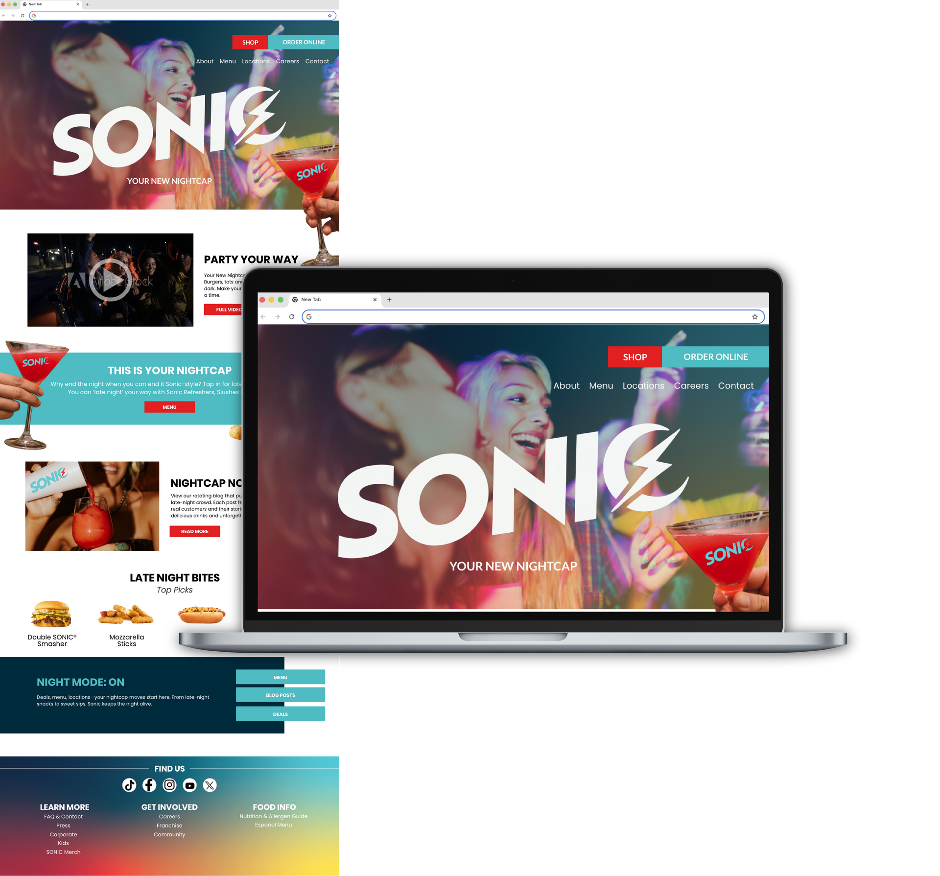
When creating the mockup for our website redesign, I used high energy images, and similar drink paraphernalia to make the campaign feel cohesive and recognizable. Using Adobe XD, I was able to create a full home page that has UX in mind. I added easy navigation tabs and blocks that direct our consumers directly to where we want them to go. Instead of just being a repeat of the menu people see in the drive thru line, this website is a full experience.
To help YAYAs feel connected to this new brand, we added a blog section where real consumers can send in stories from their nights at Sonic. Along with the high energy visuals, this will increase our site stickiness by encouraging users to poke around, not just look for menu items.
Working with my talented team of MU strat commers, we created a full campaign that I am extremely proud of. We took a risk and jumped right into the deep end on this out-of-the-box idea. This project allowed me to experience the importance of critique. We presented every concept and sketch to a full lecture hall and utilized student and professor feedback to sharpen every aspect of our work.
